Below are some graphic concepts and deliverables that I have created for a church organization.
SERMON SERIES
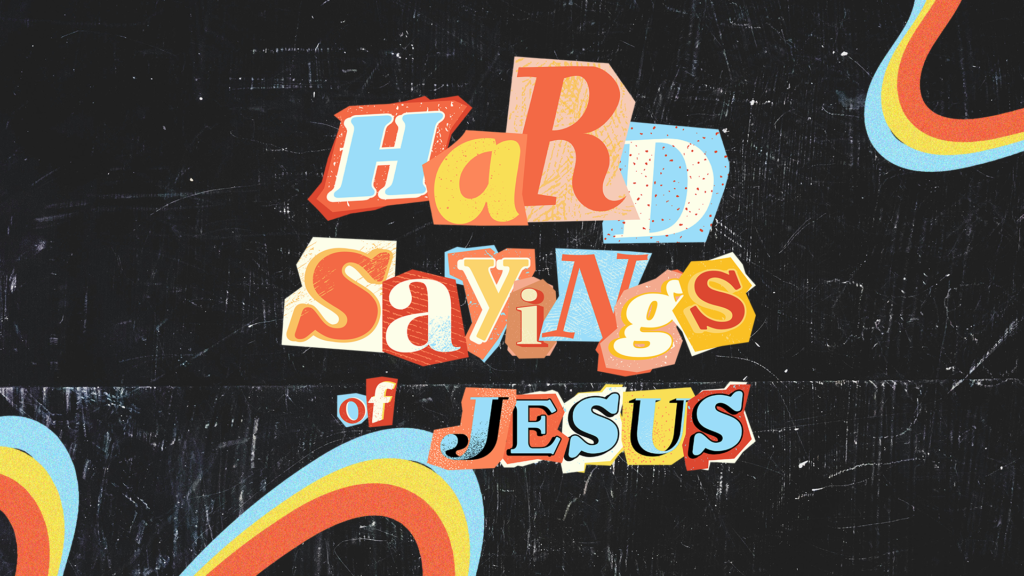

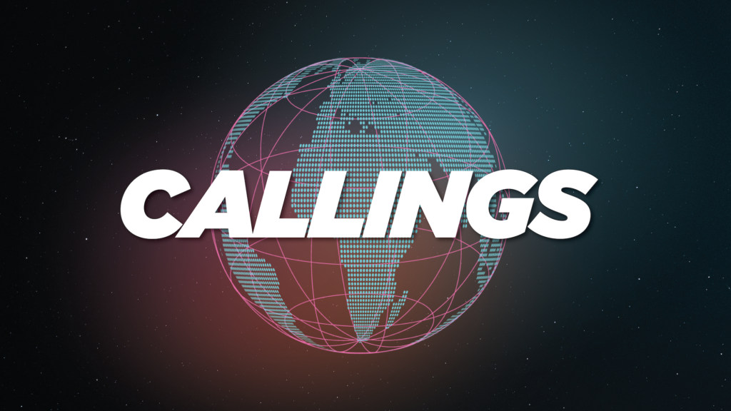
Above are three examples of sermon series thumbnails I created for a church. Hard Sayings of Jesus was a more serious conversation so we wanted the artwork to lessen the intensity by providing a playful graphic with summer colors. Heat Wave was a summer series so we wanted it to scream summer and beach vibes. Callings was all about discovering what God has called us to and our church to and how that impacts the world. We wanted to make that clear through the artwork.
YOUNG ADULT GATHERING
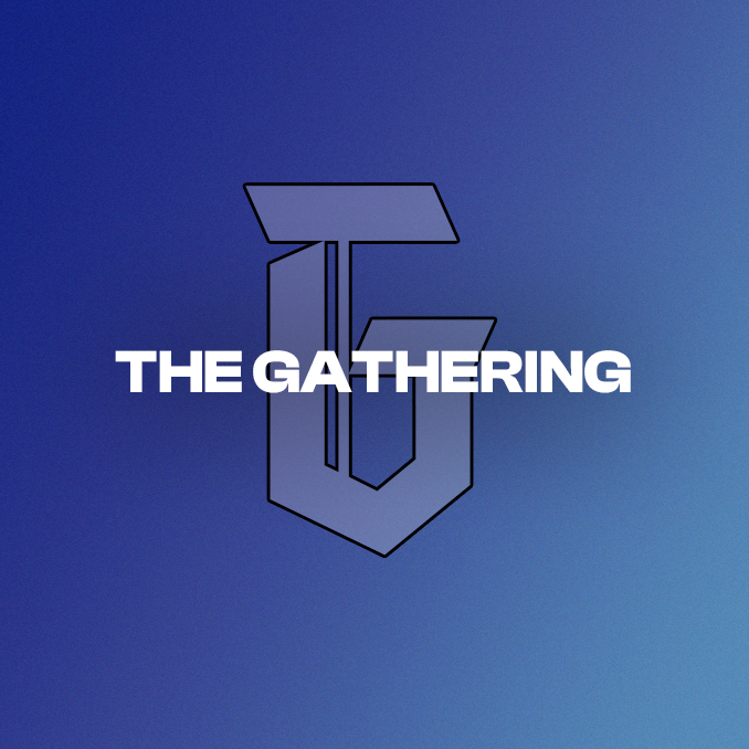
Above are there concepts I created for a church’s LED Wall for a young adult gathering event outside of Pittsburgh, Pennsylvania. I made sure to stay in brand with the ministry’s colors but added some grain and drop shadow to provide dimension.
LEADERS ADVANCE
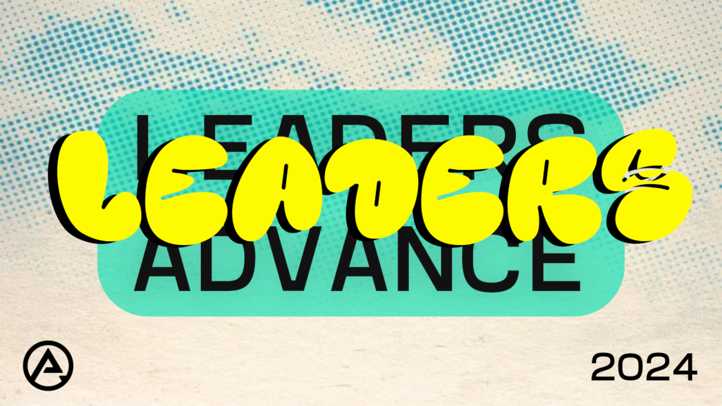
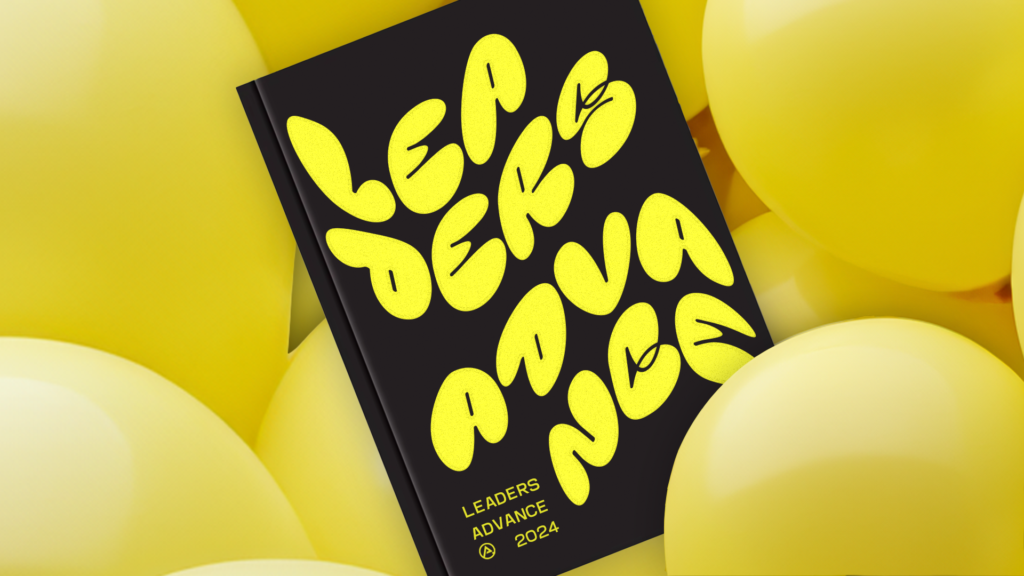
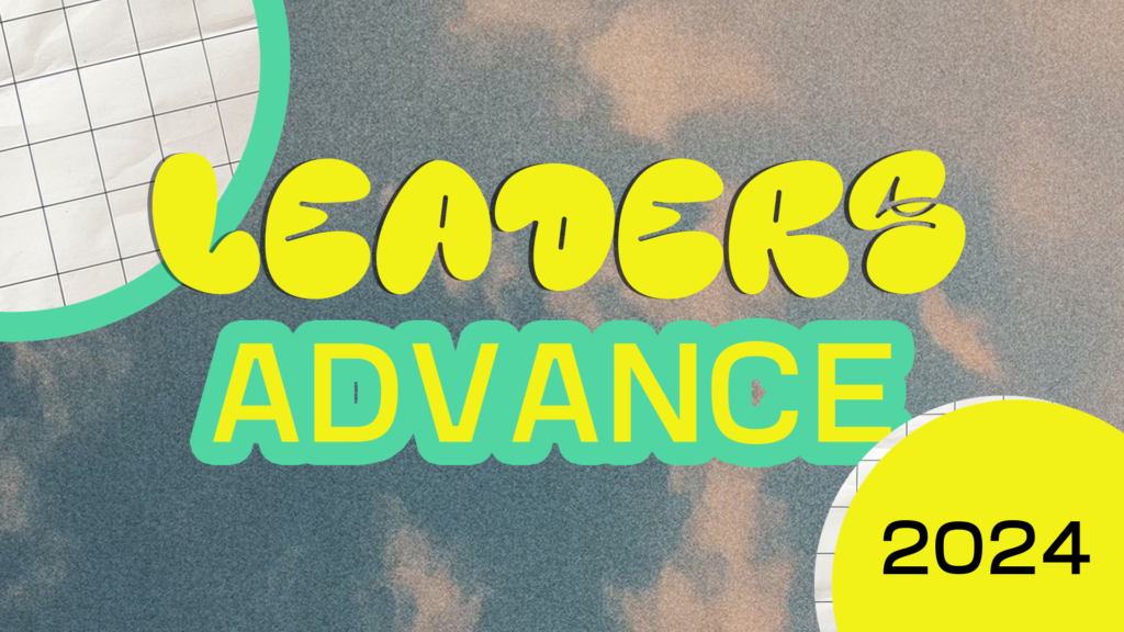
Above are three concepts I created for a church’s leaders mini Conference. They wanted to use green and yellow, go in a 90s direction with the graphic and use that bubble font. I provided three options with those colors and made sure I kept the theme in an overall playful direction.
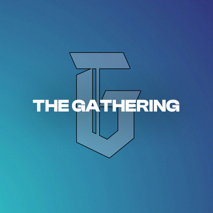
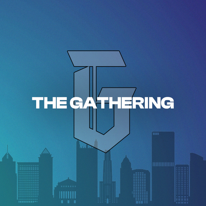
CALLINGS SERMON SERIES
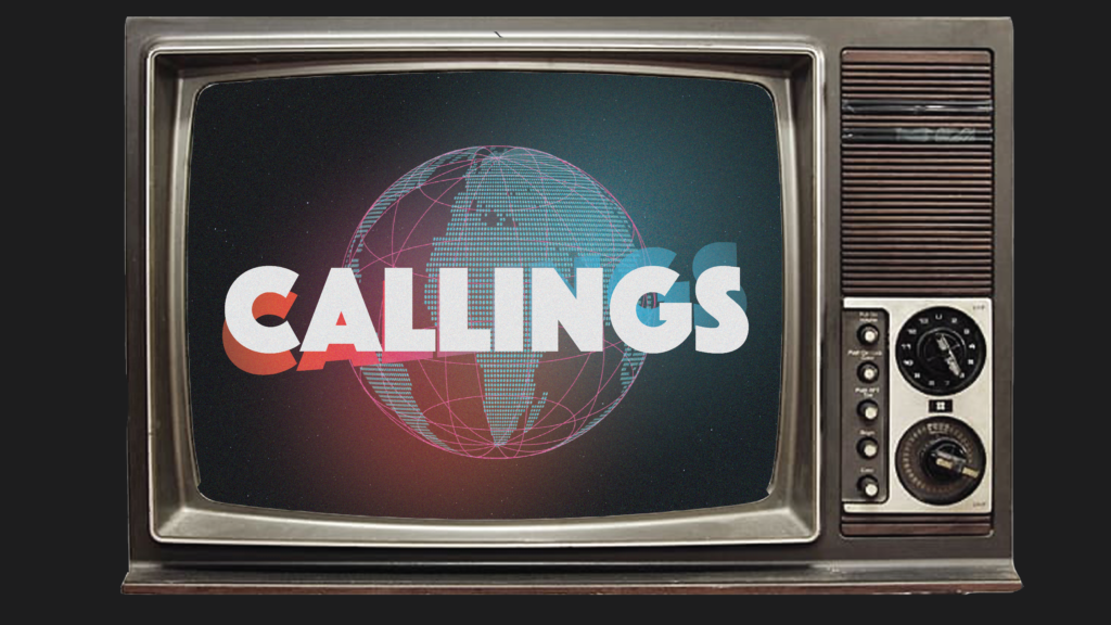
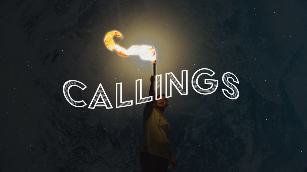
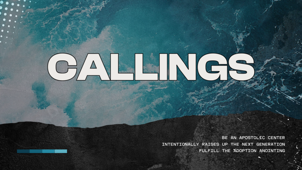
Above are three concepts I created for the Callings series. The church I made these graphics for were discussing the Callings the church has had for several years. They were discussing in a three week sermon series what makes this church unique. The first graphic I created showcases how long this church has had these callings by using a retro tv to showcase that. The Second one was showcasing how each individual needs to play their part in the callings and shine their light. The last one was a more basic approach that utilized the churches main two brand fonts. I used Adobe Illustrator, Photoshop, and Canva.
YOUTH CAMP LANYARDS
Above is a lanyard I made for an upcoming youth camp at a church. The youth pastor came up with the design for this camp and provided me with the assets. I played around with them to create the lanyard graphic above.
WOMEN’S CONFERENCE LANYARDS
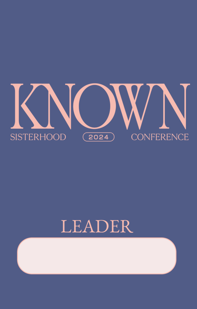
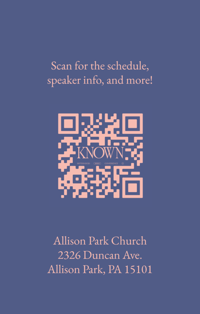
Above is a lanyard I made for a women’s conference. The colors and fonts were a part of the conference’s main brand.
REVIVAL WEEK GRAPHIC


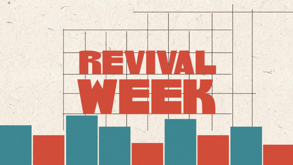
Above are three concepts I created for an upcoming Revival Week. I received a few color and theme directions and provided a groovy design, and grunge design, and a minimalist design. This event is taking place the second week in September so I was instructed to use deeper fall colors to provided warmth but not be too over the top with it. The last design was a different color scheme to provide variety when choosing one to move forward with.
SOCIAL POST GRAPHIC
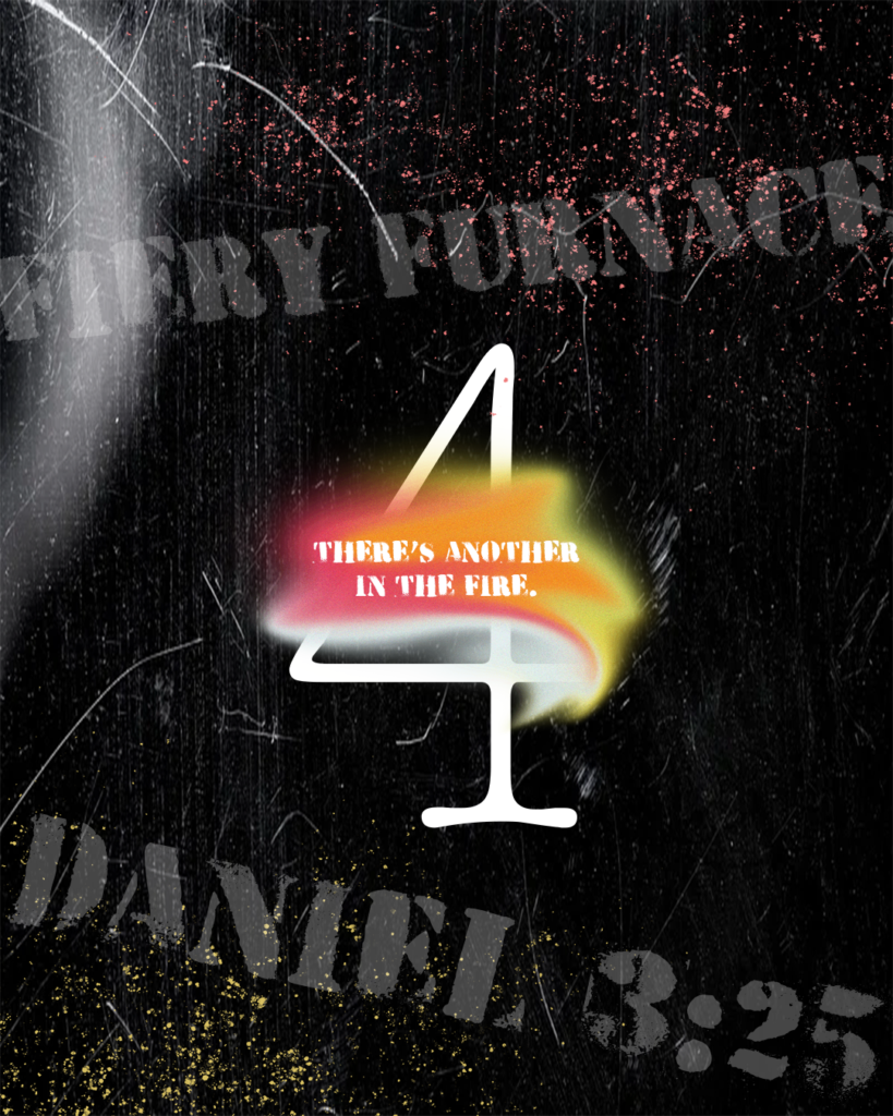
Above is a graphic I made based off of a message given on Sunday which talked about Daniel 3. The speaker talked about the fiery furnace and how there was a fourth man (God) who was I the fire with Shadrach, Meshach, and Abednego. This design was more abstract and showcased the elements of fire in an artistic way and incorporated the number 4 which was the man part of the pastor’s message.
TREASURED KIDS LANYARD
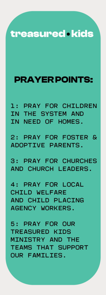
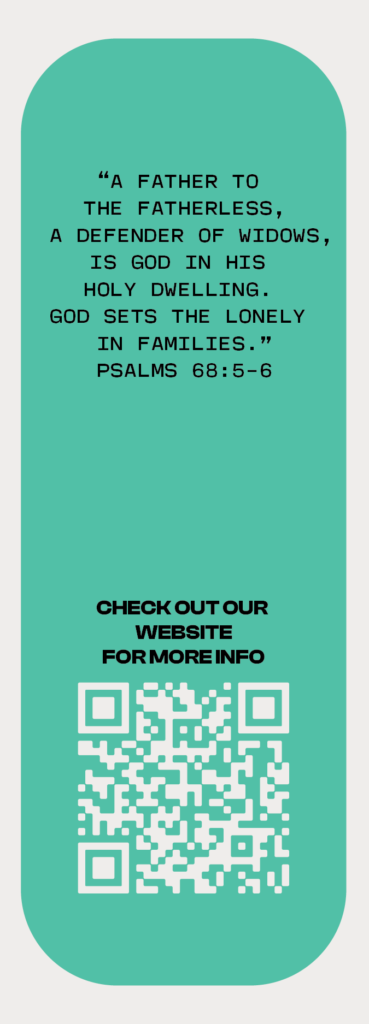
Above is a bookmark I created with prayer points for a church’s children’s ministry. The church was focusing on ways we can encourage families to pray for children and leaders in the foster and adoptive field. I created a bookmark with the ministry’s brand colors and fonts.